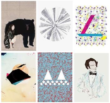
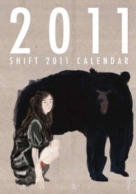
Shift 2011 calendar released !

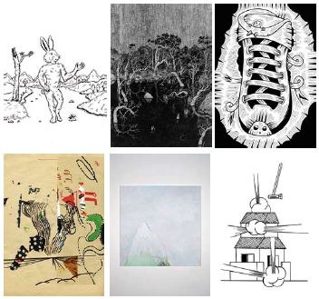
The Shift Calendar Competition started in 2003 with an aim to discover fresh creators by SHIFT. For the 8th competition of this year we have received 1,623 entries
from 35 countries. 12 carefully selected works will decorate each month of the Shift calendar, which will be on sale from October 1st and appeared in shops and
galleries around the world.
Taking as an important role in making opportunities for worldwide creators to extend the stage for their activities, Shift calendar competition has delivered a number of
visual works through these 8 years and the number of them counts 96 works. We believe the calendar competition will take many creators to various places where they
can meet and discover, and will outspread the circle of creation derived from there.
It is time for seeds to begin to sprout for 2011. Enjoy the 12 visual works selected for the calendar created by artists and designers who are waiting to be flowered.

s1

s2

s3

SHIFT 2011 CALENDAR
Spec: All colour / 28p / 210×297 mm
Price: 1,260 yen (tax included)
Produced by Shift Factory
Printed by Syoubunsya

http://www.shift.jp.org/en/
http://www.shift.jp.org/en/archives/2010/09/shift_2011_calendar.html

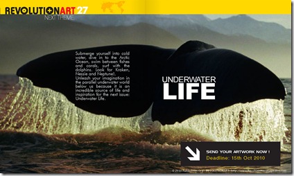
Join Revolutionart 27! :Underwater Life

revolutionart_issue_26_Page_136

Submerge yourself into cold water, dive into the Artic Ocean, swim between fishes and corals. Surf with dolphins. Look for Kraken, Nessie and Neptune.

Unleash your imagination in the parallel underwater world below us because it is an incredible source of life and inspiration for the next theme: UNDERWATER LIFE.

Deadline: 15th Oct.

More info: https://revolutionartmagazine.com/how_to_participate.html

Tips to choose good fonts for your projects

1. The Letterform
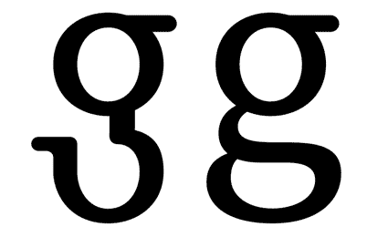
The ‘ductus’ represents the framework of a type. It is very important. For legible text we need typographies with a simple ductus without complex details. Those details distract from the reading process and we need the reader to pay attention to the content and not the text.
2. The Weight
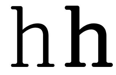
When we discuss the ‘weight’ of a type, we refer to a consistent relationship between the characters themselves, and the light of the page that flows around them. If you use a light version of a type for a lot of text, reading of this text will probably become tiring and nobody will want to read it.
3. The Contrast
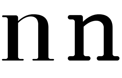
The contrast refers to the thickness difference between vertical and horizontal strokes. The difference between the thicker and the thinner part of the character. Bodoni and Didot are very contrasted type designs. Try to read the photocopy of a photocopy of a photocopy of text layed out in Bodoni. You will probably see only vertical strokes. Good type design should be able to resist a lot of copies. It must be strong, solid, but not coarse.
4. The axis
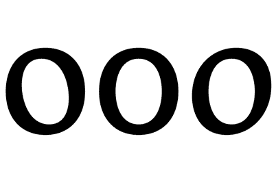
In my view, the axis of a type design could affect reading. Vertical strokes prevail in a text type and if the axis is diagonal, the eye will have trouble following that line of text. If the type uses more than one axis, a line of text will appear as if dancing which makes is harder to read. If we use an orthogonal axis, the characters can’t dance.

 

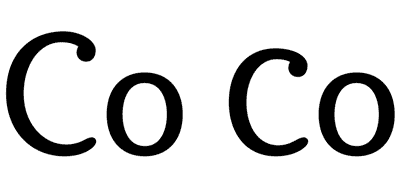
5. x height
The area between baseline and x height contains most of the readable information (75% of the lower case letters). It is a very important area at the moment of reading text. Long ascenders and descenders require a small x hight. If we compare two types of designs, one with long ascenders and the other with short ascenders, we can see that the x height of the second one will be larger, so it will obviously be more legible. Look up for the difference between Times New Roman and Mrs. Eaves.
 

6. Capital letters height
Older typefaces designs consider the same height for the ascenders and the capital letters. In any cases capitals are bigger… But the appearance of a word in upper case between lower caps is usually ugly. When I write the word ‘Garamond’ I feel the ‘G’ as a dinosaur and the ‘a’ as its prey…


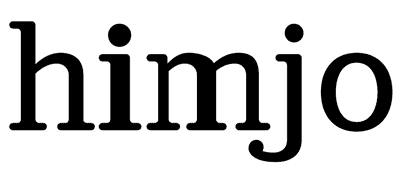
7. Endings and details
When we use a font in a big size (for example in a poster), we enlarge everything. All the small details of the type design become evident, as well as the mistakes. A lot of typographies are badly drawn. As designers, we should not accept this.
 

8. Text and texture
A block of text looks like a texture from a distance. This texture must be uniform, without thicker characters or spots that could attract the attention.
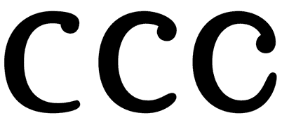
 

9. Degree of the Counter Opening
In many type designs, the counters are too closed. It could cause legibility problems, because somebody could read ‘o’ instead of an ‘c’. So, if the internal counter is too opened (as in Frutiger), it will start to mingle with the external counter, generating a lot of white (and it looks ugly).

 

10. The Fish Effect
This effect becomes evident when the internal counter is bigger than the space between characters. It looks very strange where round and straight characters join.


11. External counter
There are small details that make a text type design more legible. A carefully designed external counter leads to better text understanding. Think about the connection between the vertical stroke of the ‘n’ and its curve, or the difference between ‘rn’ and ‘m’.
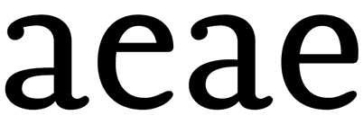
 

12. Internal counter
A small eye in an ‘a’ or an ‘e’ character will probably disappear, especially in small type sizes. These are the most used characters in most of the languages, that is why this becomes a very big problem.
13. Is the set complete?
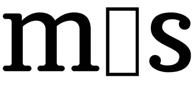
How many times do we note that the font we are using lacks a character? It always happens when our design is almost finished. Terrible! We must change the type and check out the complete text again. Many type designers don’t design some characters such as ñ, written accents, tildes, points, commas or numbers… It is better to check the font out before using it.
14. The family
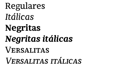
It is important to verify that the type family is plentiful, with variations in weight, black, whites and italics… Check out that the italic is as legible as the regular version. Sometimes they have a lot of rococo details.
15. Letter spacing
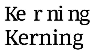
There are fonts with bad or non-existent letter spacing and obviously, they don’t work well. A good designer will try to correct the letter spacing that he (she) considers bad, but it is too much work when all the spacing looks bad… There are software packages that can help, but it is not the same as good typographer work. Try to use fonts with correct letter spacing and metrics…
Best digital art: Annual Design Awards 2010

Revolutionart sponsored the category BEST DIGITAL ART in the worldwide prominent event: Annual Design Awards 2010.  When  the results were published we had the opportunity to met our new winner. http://www.annualdesignawards.com/winner/best-digital-art-2010.html

Steve McGhee will be one of the special guests for “Revolutionart 26 – Internet” when we will show a high resolution the special poster he created for Revolutionart and other awesome masterpieces.

Revolutionart The Awakening Poster by Steve McGhee

The deadline for Revolutionart 26 is coming.  Send your artwork now!

Cannes Art Fair – Exhibition Shows the Queen as She’s Never Been Seen

Mia Funk

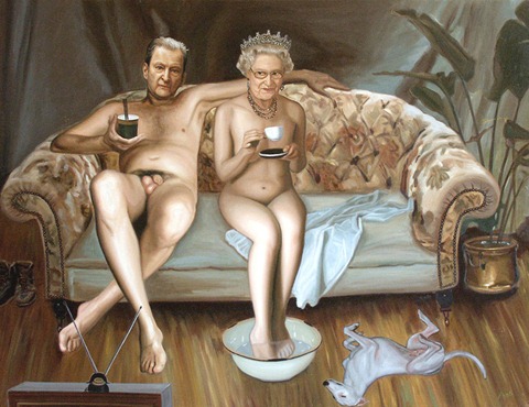
The residents of Cannes are used to seeing celebrities along La Croisette, but this year visitors will be more than surprised to view a naked Queen of England painted alongside Lucian Freud at the Cannes Art Fair. In the painting her majesty reveals nothing more than a smile. People at a preview for the fair were practically in hysterics as they gazed at Mia Funk’s painting, An Audience with the Queen.

An Audience with the Funk won the Thames & Hudson Prize in May 2010. A British visitor to the preview compared the painting to the “withering pictures of Hogarth. It’s refreshing to find a new work that’s memorable and resonates with humour.”

Mia Funk’s agent, Christian LaPorte says, “The sharp satire of An Audience with the Queen deals with a topic usually highly insulated  in terms of imagery. Royalty in Europe depends more and more on image to remain royal in the absence of more traditional means of power. The stagy setting and the banal activities including the palpable fleshiness of Freud and the Queen is indeed stronger than caricature as it does not depend on exaggeration or distortion, but a precisely imagined reality in which traditional image making is kept very purposely at bay. This suggests a strange pictorial iconoclasm, where pictures are used to attack imagery in favour of another communication.”

Watching the reaction to the painting, Mia Funk said she is delighted that it’s being “received in the spirit in which it was painted. There is far too much serious stuff out there.”

The Cannes Art Fair runs from 11th to 16th August 2010, at La Salle de la Capitainerie, Port de Cannes, La Croisette, Cannes. There are over fifty invited artists with special participation of the Russian Academies of Ekatarinburg of Nizni.

Calling for Revolutionart 26

iNTERNET design

INTERNET.
One of the most important inventions of the humanity.
Find out how access to information through Internet is
changing the way we think, the way we do things, our
communities and our civilization.
…a tool for democracy?
…a new weapon for crime?
…the liberation of culture?
…a social meeting point?
What is INTERNET for you?
Follow the guidelines and join Revolutionart 26:
https://revolutionartmagazine.com/how_to_participate.html
Deadline : 15th August -  Send your work now!

// DOWNLOAD //
Revolutionart 25 "Evolution" is online !
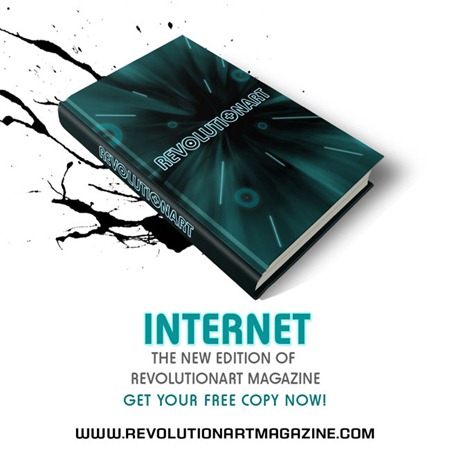
Go and get your free copy at
http://www.RevolutionartMagazine.com

// SPREAD OUR POSTER //
Support our art movement by posting our promotional poster wherever you want:
http://www.deviantart.com/download/169720007/Revolutionart_Magazine_2...

// REVOLUTIONART’S COMMUNITY //
Present yourself and promote your works and thougths at the
Revolutionart Community.
http://www.revolutionartmagazine.com/community

// SHARE ON FACEBOOK //
Please click on this link and show us your support.
http://www.facebook.com/share.php?u=http://www.revolutionartmagazine.com

Festival International Montreal en Arts

communique_image1_8juillet

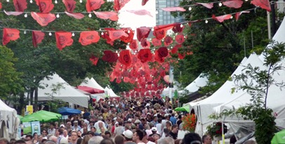
From July 8 to the 11th, FIMA presents new artists on the BoulevArt, on Sainte-Catherine Street East, between Saint-Hubert and Papineau. This upcoming weekend offers a variety of activities including: AT THE MOVIES, a series of short film projections; Space Odyssey, performances by VJs and DJs from SAT, as well as the Contemporary Experiences with Émilie Franceschin (France) and her dismembered dance, Mark Cooley (USA) with his modified video game play and Roxane Chamberland’s strange culinary performance. Friday and Saturday at the de l’Espoir Park, located corner of Panet, urban artists will be painting gigantic canvasses live while artisans will be offering live demonstrations of their craft at the corner of Champlain, a few streets east. Other features include FIMA’s colourful auction hosted by François Gourd on Saturday. FIMA 2010, an event not to be missed!

FIMA – July 1 to the 11, 2010 – Sainte-Catherine East, between Saint-Hubert and Papineau For more information, visit the Website: www.festivaldesarts.org.